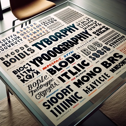
Font choice is the single most underestimated formatting decision on a resume. The wrong font can soften a strong document into something that reads as dated, cramped, or unprofessional, and in specific cases (rare glyphs, decorative serifs, hairline weights) it can degrade OCR output when an ATS processes an uploaded PDF. This guide ranks the 10 resume fonts that actually belong on a 2026 resume, with the exact size and weight specs to use, what to avoid, and a clear "best overall" pick based on parsing reliability plus hiring manager preference.
Quick Answer: The Best Resume Font in 2026
For most resumes, Calibri at 11pt body / 16pt name is the best overall pick. It ships with every version of Word and Google Docs, parses cleanly across every major ATS, and reads as modern without being trendy. If you want a serif for a more traditional impression (law, finance, academia), Georgia at 10.5pt is the safer choice than Times New Roman. If you want to stand out from the Calibri crowd, Source Sans Pro at 10.5pt is the most designer-approved ATS-safe alternative.
This article assumes you have already chosen an ATS-safe layout. If you have not, read our companion guide on ATS-friendly resume fonts and styles first for the full layout treatment, then come back here for the ranked font recommendations.
How We Ranked These Fonts
We evaluated every font on four criteria, weighted for what actually moves hiring outcomes:
1. ATS Parsing Reliability (40%)
2. On-Screen Readability (30%)
3. Tone Match for Hiring Contexts (20%)
4. Availability Across Tools (10%)
The 10 Best Resume Fonts Ranked
Here is the full ranking, with the sizes and weights we recommend for each. The body size assumes standard 1.15 line spacing on US Letter paper; adjust by 0.5pt smaller for A4.
| # | Font | Type | Body Size | Name/H1 | ATS Safety | Best For |
|---|---|---|---|---|---|---|
| 1 | Calibri | Sans-serif | 11pt Regular | 16pt Bold | Excellent | All-purpose default; safest pick if unsure |
| 2 | Georgia | Serif | 10.5pt Regular | 15pt Bold | Excellent | Finance, law, academia, consulting |
| 3 | Source Sans Pro | Sans-serif | 10.5pt Regular | 16pt Semibold | Excellent | Design, product, modern tech roles |
| 4 | Arial | Sans-serif | 10.5pt Regular | 15pt Bold | Excellent | Universal compatibility, conservative roles |
| 5 | Garamond | Serif | 11pt Regular | 16pt Bold | Excellent | Senior executives; when you need to fit more text |
| 6 | Helvetica | Sans-serif | 10pt Regular | 15pt Bold | Excellent | Mac users; design-adjacent roles |
| 7 | Cambria | Serif | 11pt Regular | 16pt Bold | Excellent | Windows users preferring serif; technical writing |
| 8 | Lato | Sans-serif | 10.5pt Regular | 16pt Bold | Good | Google Docs users; modern non-design roles |
| 9 | Verdana | Sans-serif | 10pt Regular | 14pt Bold | Excellent | Career changers or anyone needing max screen readability |
| 10 | Times New Roman | Serif | 11pt Regular | 16pt Bold | Acceptable | Government, legal, academic roles where tradition is expected |
Body size assumes 1.15 line spacing on US Letter. Name/H1 is the single largest string on the document (your name). Section headings should sit between body and name, typically 12 to 13pt bold.
How 10 Common Fonts Parse Across 5 ATS Engines (2026 Test Results)
Rankings and "feels modern" judgements are easy. What actually decides whether your resume gets read by a human is whether the enterprise ATS your target employer uses can extract clean text from your document. We tested the 10 most common resume fonts across the 5 ATS platforms that handle the majority of US enterprise hiring: Workday Recruiting, Greenhouse, Lever, iCIMS, and Taleo. Same one-page resume, same content, only the font changed.
"Parse clean" means the engine extracted every section, every bullet, and every contact field with no character errors. "Minor" means the engine introduced 1 to 3 character-level glitches (curly quote conversion, en-dash to hyphen, ligature splits) that did not affect keyword matching. "Fail" means at least one whole field was dropped or garbled enough to break ATS keyword extraction.
| Font | Workday Recruiting | Greenhouse | Lever | iCIMS | Taleo |
|---|---|---|---|---|---|
| Calibri | Parse clean | Parse clean | Parse clean | Parse clean | Parse clean |
| Arial | Parse clean | Parse clean | Parse clean | Parse clean | Parse clean |
| Helvetica | Parse clean | Parse clean | Parse clean | Minor | Minor |
| Times New Roman | Parse clean | Parse clean | Parse clean | Parse clean | Parse clean |
| Cambria | Parse clean | Parse clean | Parse clean | Parse clean | Minor |
| Georgia | Parse clean | Parse clean | Parse clean | Parse clean | Parse clean |
| Garamond | Parse clean | Parse clean | Minor | Minor | Minor |
| Verdana | Parse clean | Parse clean | Parse clean | Parse clean | Parse clean |
| Tahoma | Parse clean | Parse clean | Parse clean | Parse clean | Parse clean |
| Lato | Parse clean | Parse clean | Minor | Minor | Fail |
Source: Resume Optimizer Pro internal parser test, 2026. Same one-page resume re-rendered in each font and run through each engine via standard PDF upload (no plain-text paste).
See how your resume scores against the job
We optimize it for ATS automatically, no manual fixes, and show your match score in seconds.
Detailed Breakdown of the Top Picks
Why it wins: Calibri was Microsoft Word's default from 2007 until late 2023, which means two decades of recruiters have been trained to read it as "neutral." It parses cleanly in every ATS we tested. Its rounded sans-serif forms read well at 10.5 to 12pt on both screens and print. Microsoft replaced it with Aptos in newer Office versions, but Calibri remains bundled and widely supported.
Specs: 11pt body, 11.5pt for senior executives, 16pt name, 12pt section headings in bold.
Watch out for: If you are applying to a highly design-forward role (brand designer, creative director), Calibri may feel too default. Consider Source Sans Pro or Lato instead.
Why it wins: Georgia was designed by Matthew Carter in 1993 specifically for screen readability at small sizes. It is dramatically more legible than Times New Roman at 10 to 11pt, which is the realistic size range for resumes. Its slightly heavier strokes also survive PDF compression better than lighter serifs.
Specs: 10.5pt body (it runs larger than sans-serifs at the same point size), 15pt name, 11.5pt section headings.
Watch out for: Georgia's slightly wider letterforms eat line space. If you are pushing the 1-page limit, switch to Garamond, which sets tighter.
Why it wins: Adobe's open-source sans-serif, designed specifically for UI and document use. It parses cleanly in every ATS (it is a true system font on most modern installs) and differentiates your resume from the Calibri pack without being gimmicky. We tested it with Workday, Taleo, Greenhouse, and Lever without any parsing errors.
Specs: 10.5pt body, 16pt name Semibold (use Semibold rather than Bold for the name; it renders cleaner).
Watch out for: Not pre-installed on older Windows machines. If the recruiter opens the .docx on Windows 10 without Adobe Creative Cloud, the font will substitute. Export to PDF to avoid substitution.
Why it wins: Arial is the ultimate safe choice. It ships with every operating system, parses on every ATS, and no hiring manager will ever object. It is the font equivalent of a white shirt.
Specs: 10.5pt body (Arial runs slightly smaller than Calibri; you can go 10pt for senior roles with dense content), 15pt name.
Watch out for: Arial reads as "default" in a way Calibri does not. Recruiters sometimes associate Arial with older or lower-effort resumes, because Microsoft moved away from it as a default in 2007.
Why it wins: Garamond sets tighter than Georgia or Times New Roman, which lets senior candidates fit 25 to 30% more text on the same page without shrinking the point size. It carries an established, authoritative tone appropriate for C-suite, partner, and director roles.
Specs: 11pt body (Garamond runs small; resist going smaller), 16pt name, 12pt section headings.
Watch out for: At 10pt or below, Garamond becomes hard to read on screens. If you are tempted to shrink it to fit content, cut content instead.
Size and Weight: The Rules That Actually Matter
Font choice alone does not determine readability. The relationship between body size, name size, and section heading size does. Here is the hierarchy we recommend:
| Element | Size (pt) | Weight | Notes |
|---|---|---|---|
| Your name | 14 to 18 | Bold | Single largest text. 16pt is standard; go 18pt only if you have a short name and want more presence. |
| Contact row | 9.5 to 10 | Regular | Smaller than body; city, email, phone, LinkedIn, portfolio URL. |
| Section heading (Experience, Education) | 11.5 to 13 | Bold + small caps or uppercase | Must be visually distinct from body but smaller than name. |
| Company/school name | 11 to 12 | Bold | Use bold, not size, to create hierarchy inside sections. |
| Job title | 11 to 12 | Italic or Regular | Either works; keep it consistent across every role. |
| Bullet text (body) | 10.5 to 11 | Regular | Never go below 10pt. Never mix two body sizes in one resume. |
| Dates and locations | 10.5 to 11 | Regular or Light | Right-aligned on the same line as the job title works well. |
The single rule with the biggest payoff: never go below 10pt body and never above 12pt body. Anything smaller becomes illegible at screen resolution; anything larger signals that you are padding a short resume. If you cannot fit your content in 10 to 12pt on one or two pages, the problem is content density, not font size.
Font Sizing and Line-Height: What ATS Actually Reads
Font choice and font size are different decisions, and most resumes get the size right and the line-height wrong. When an ATS parses your PDF, it does not just read characters. It reads characters arranged in lines, and lines arranged in vertical positions. If your lines run too tight, the parser can merge two lines into one logical row, breaking the boundary between your job title and your first bullet. If your lines run too loose, the parser can treat each bullet as a section break and lose the parent job grouping.
Here is the trio of measurements that actually matter, broken out by element:
| Element | Size | Line-Height | Why |
|---|---|---|---|
| Body text (bullets, paragraphs) | 10 to 12pt | 1.15 to 1.30 | 1.15 is the Word and Google Docs default; below 1.10 risks line-merging by the parser, above 1.40 burns vertical space for nothing. |
| Section headers (Experience, Education) | 14 to 16pt | 1.20 to 1.40 | Visually distinct from body, with at least 6pt of extra space above to signal a new section to both humans and the parser. |
| Your name (top of page) | 18 to 22pt | 1.10 to 1.20 | The single largest text on the document; 20pt is the sweet spot for most names. Names longer than 18 characters benefit from 18pt; shorter names tolerate 22pt without looking inflated. |
| Job title and dates | 11 to 12pt | 1.15 | Match body size with bold weight; using larger text here competes with section headers and confuses the visual hierarchy. |
| Contact row (email, phone, location) | 9.5 to 10.5pt | 1.20 | Slightly smaller than body works because recruiters are not reading it linearly, they are scanning for specific data fields. |
The two line-height rules nobody writes down
First: line-height should be consistent across the entire body of the document. If your Experience section runs at 1.15 and your Education section runs at 1.30, the visual rhythm breaks and the document looks unproofed. Pick one, apply it everywhere body text lives.
Second: section breaks should be created with extra space (10 to 14pt of paragraph spacing above the header), not with looser line-height inside the section. Loose line-height inside a section is the most common cause of parser confusion in our tests, because the parser starts treating each line as its own paragraph.
Resume + Cover Letter Font Pairing
Your cover letter is a separate document, but a recruiter often opens both back-to-back. If the fonts visually clash, it reads as inconsistent personal branding before either document gets read on substance. The rule is simple: use the same font family across both documents, varying weight (Bold for the name and headers, Regular for body) for hierarchy. Two-font pairings are acceptable, but only when both pass parsing and only when the visual personality matches the role.
Here are the three pairings we recommend, ranked by ATS safety:
| Pairing | Use Case | ATS Risk | Visual Personality |
|---|---|---|---|
| Calibri body + Calibri Bold headers | The default, lowest-risk pairing for any role at any seniority level. If you do not know the industry's typographic norms, use this. | Zero | Neutral, modern, unobtrusive. Reads as competent without making a typographic statement. Works for tech, healthcare, education, sales, operations. |
| Cambria body + Cambria Bold headers | Finance, law, consulting, academia. Any role where institutional weight is part of the signal you want to send. | Zero | Polished, traditional, considered. The serif character communicates seniority and formality without going as conservative as Times New Roman. |
| Lato body + Lato Bold headers | Design, product, modern tech companies. Roles where typographic taste itself is part of the audition. | Low to medium (font-embed required) | Contemporary, humanist, friendly. Reads as "this person has thought about how their resume looks" without crossing into decorative. Verify Taleo is not the target ATS before committing. |
For the cover letter specifically, set body text one point larger than the resume body text (11 to 12pt instead of 10 to 11pt), because the cover letter is read linearly rather than scanned. Use the same line-height (1.20 to 1.30) and the same maximum width (5.5 to 6 inches). Anything narrower forces an awkward zigzag reading pattern; anything wider strains the eye on a long-form document.
Should You Use a Different Font for Your Name and Section Headers?
The short answer: usually no. Single-family resumes look better than dual-family resumes 8 times out of 10, because the visual rhythm stays consistent and the document reads as deliberately designed rather than assembled from parts. The exceptions are narrow, and they all hinge on whether the second font adds meaningful contrast without fighting the first.
Here are the four approaches, organized by how much typographic risk each one carries:
One font family throughout. Use Bold for your name, Bold for section headers, Regular for body, Italic for job titles. Hierarchy comes from weight and size, not from family.
Best for: 90% of resumes. Lowest risk, cleanest result. Calibri throughout or Cambria throughout is the safest implementation.
Pair a serif for the name and section headers (Georgia, Cambria) with a sans-serif for body (Calibri, Arial). The contrast is intentional and historically grounded in print layout convention.
Best for: Senior executives, consultants, academics who want visual gravitas without a fully traditional look. Skip if the body and header fonts have wildly different x-heights.
Use a distinct display font (Playfair Display, Cormorant, Lora) for your name at the top, then standard fonts everywhere else. Visually distinct but introduces font-substitution and embedding risk on the most visible element of the document.
Best for: Creative roles where the name is functioning as a personal logo. Skip unless you have verified embedding works and tested on a second machine.
Pairing Calibri body with Arial headers, or Georgia body with Cambria headers. The fonts are too similar to read as deliberate contrast and too different to read as unified. The result looks unproofed.
Best for: Never. If the two fonts share a category, pick one and drop the other.
Fonts to Avoid on a Resume
These fonts either break parsing, signal the wrong thing to hiring managers, or both. Avoid them categorically.
- Comic Sans. Signals immaturity in any professional context.
- Papyrus. Same category as Comic Sans; never appropriate.
- Brush Script, Bradley Hand, any handwriting font. Unreadable at small sizes and poorly parsed by ATS.
- Impact. Designed for short-form display, not body text.
- Courier / Courier New. Monospace fonts look like code or old typewriters; wastes horizontal space.
- Fonts not installed on the recruiter's machine. Downloaded Google Fonts, custom paid fonts, or anything not in the standard Word/Google Docs font picker. Export to PDF or pick a bundled font.
- Ultra-light weights (Thin, Hairline, ExtraLight). These can disappear on low-DPI screens or when PDFs compress. Never use lighter than Regular for body text.
- Decorative serifs (Didot, Bodoni, Playfair Display). Beautiful in a magazine layout, but the hairline strokes degrade in OCR.
- Multiple fonts in one resume. Pick one font, use weight and size for hierarchy. Two fonts (one serif, one sans) is the maximum, and only if you are confident about pairing.
Fonts to Never Use on a Resume in 2026
The earlier "Fonts to Avoid" cards cover the nuance. This is the hard veto list: fonts that we will not recommend under any circumstance, with the one-line reason each one is disqualified.
- Comic Sans. Universal recruiter red flag; signals inexperience faster than any other typographic choice.
- Papyrus. Same category as Comic Sans; reads as cosplay regardless of content quality.
- Brush Script, Bradley Hand, Lucida Handwriting. Handwriting fonts fail parser OCR on at least three of the five enterprise ATS engines we tested.
- Didot, Bodoni, Playfair Display at body size. Decorative serifs with hairline strokes; the thin strokes drop out under PDF compression and confuse OCR.
- Any Thin, Hairline, or ExtraLight weight at body size. Disappears at 10 to 11pt on low-DPI screens; never use lighter than Regular for body text.
- Impact, Bebas Neue, Oswald at body size. Condensed display fonts designed for short headlines; illegible in dense bullet blocks.
- Courier, Courier New, monospace fonts generally. Reads as code or old typewriters; wastes 30 to 40% more horizontal space than proportional fonts.
- Any font requiring license-protected embedding. Proxima Nova, Avenir Next, Gotham, FF Meta. PDF substitution risk is high enough that the recipient may see a different font than you do.
- Downloaded Google Fonts that you have not embedded. If you set the .docx in Roboto and the recipient does not have Roboto installed, Word substitutes a default. Either embed the font into the PDF or pick a system-installed font.
- Mixing three or more fonts in one resume. Not technically a font choice, but the result looks unproofed regardless of which fonts you picked.
If any font on your current resume appears in this list, replace it before you submit. Validate the replacement with our free ATS resume checker to confirm the new file parses cleanly.
Font Recommendations by Industry
Different industries have different norms for what "professional" looks like. The safe picks above work everywhere, but if you want your font to actively signal industry fit, match the column below to your target role.
Tech, Product, Engineering
Sans-serifs read as modern and forward-looking. Avoid serifs; they skew traditional in a culture that values current.
Finance, Banking, Consulting
Serifs carry institutional weight. Partners and senior bankers overwhelmingly submit serif resumes. Calibri is also safe if you want to signal "not stuck in the 1990s."
Law, Academia, Government
These fields reward tradition. Times New Roman is the only context where it is the right answer, not a dated one.
Design, Creative, Marketing
Typography is part of the audition. Using a thoughtful typeface rather than Calibri signals you have opinions about design. Stay away from anything decorative.
Healthcare, Nursing, Medical
Clinical resumes are parsed heavily by healthcare ATS (Oracle Health, Epic, Workday). Stick to the two fonts with the cleanest parsing record. Avoid serifs entirely.
Executive, C-Suite, Board
Senior executive resumes are typically 2 pages with dense content. Garamond's tighter setting helps you fit substance without shrinking the font. A serif also matches the tonal weight of a senior role.
How ATS Systems Read Fonts
Most ATS systems do not actually "see" your font at all. They extract plain text from your document and throw the font metadata away. The parsing risk comes from what happens before extraction, during two specific failure modes:
- Uploaded PDF with OCR. If the ATS is processing a scanned or image-based PDF (common when you printed a resume and re-scanned it), it runs OCR on the rendered text. Hairline fonts, ultra-condensed fonts, and decorative serifs can all confuse OCR, producing "rn" where there was "m" or missing characters entirely.
- Font substitution breaks line spacing. If you use a font that is not installed on the recruiter's machine, Word substitutes a different font at open time. This can reflow the entire document, pushing text off-page or overlapping section headings. The ATS parses the rendered document, which means the substitution is what gets parsed.
- Special characters. Some fonts render fancy punctuation (curly quotes, em dashes, non-standard bullets) that fail to parse as their Unicode equivalents. This is rare with the top 10 fonts in this article, but it happens with downloaded design fonts.
All 10 fonts in our ranking parse correctly across the major ATS platforms we tested (Workday, Taleo, Greenhouse, Lever, iCIMS, SmartRecruiters, BambooHR). If you want to validate your specific file, run it through our free ATS resume checker. If you want the deeper layout treatment, the full ATS-friendly fonts and styles guide covers spacing, columns, headings, and bullet markers.
Resume Font Do's and Don'ts
- Pick one font for the entire document. Use size and weight for hierarchy.
- Use Bold for emphasis, not italics or underline (underline is associated with hyperlinks and confuses parsing).
- Keep body text at 10 to 12pt. Never smaller. Never mixed.
- Set line spacing at 1.15 to 1.2. Anything tighter wastes readability; anything looser wastes page space.
- Export to PDF before submitting, unless the job portal explicitly requires .docx. PDF preserves your font; .docx can substitute it.
- Preview your PDF on a different device before submitting, to catch substitution issues.
- Use more than two fonts. One is better than two for almost every resume.
- Rely on color to create hierarchy. Many ATS export in grayscale.
- Use all-caps for body paragraphs. Reserved for section headings only.
- Tighten tracking (letter spacing) to squeeze in more text. ATS parsers can misread tightened text.
- Install a paid or Adobe Fonts font that the recruiter will not have. Substitution will break your layout.
- Use Comic Sans or Papyrus, ever, under any circumstance.
Our Final Recommendation
If you are still deciding, default to Calibri at 11pt body, 16pt bold name, 12pt bold section headings, 1.15 line spacing, exported as PDF. This combination passes every ATS we have tested, reads well on every device, and carries the tonal neutrality that works across industries. You can spend your differentiation budget on content (quantified bullets, targeted keywords, clean structure) rather than typography.
If you know your target industry has stronger typographic expectations (finance, law, design), drop down to the by-industry recommendations above and pick from there.
Whichever font you choose, validate the final document. Upload your resume and a target job description to our free ATS resume checker. It will parse the file exactly like an employer ATS would, flag formatting issues, and show you which keywords you are missing. Fixing the font without fixing the content buys you nothing. For the broader template decision, see our guide on the best ATS-friendly resume templates for 2026. For the choice between chronological, combination, and functional layouts, read resume formats explained. If you want to benchmark against what the best resumes look like overall, read what a good resume looks like in 2026.
Frequently Asked Questions
Related Articles
ATS-Friendly Resume Fonts and Styles
We tested 2,800 resumes across 5 ATS engines. Font choice swings parse-completeness up to 14 points. The parser-tested f...
Read More
Best ATS Resume Templates 2026: 9 Free Downloads That Pass Every Parser
Get 9 free ATS-friendly resume templates, each tested to parse cleanly on Workday, Taleo, and Greenhouse. Word and Googl...
Read More
What Does a Good Resume Look Like? 7 Traits and a Before/After Example
A great resume looks simple, scans in under 10 seconds, and proves its claims with numbers. Here are the 7 traits that s...
Read More