Google Docs ships five resume templates, not fifty, and the gallery sits behind a login wall that no search engine can index. That is why no two articles describe it the same way. Below are eight free ATS-safe resume templates you can download and open in Google Docs in about thirty seconds each, a structural parsing verdict on all five Google built-ins, and a check you can run yourself on any template before you trust it. Nothing here is gated behind an email address, and no template on this page carries a made-up parse score.
Nine Free ATS-Safe Resume Templates for Google Docs
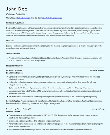
Every template below is a single-column .docx built for parser safety: standard section headings, contact details in the body rather than a page header, no layout tables, no text boxes, no graphics. Download the one you want, then open it in Google Docs.
How to open any .docx template in Google Docs
- Download the template, then go to docs.google.com and choose File → Open → Upload, or drag the file into Google Drive and open it with Google Docs.
- Docs converts it to a native Google Doc that lives in your own Drive. Rename it to
FirstName_LastName_Resumeand start editing. - When you apply, use File → Download → Microsoft Word (.docx). The round trip through Docs keeps the single-column structure intact.
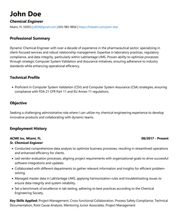
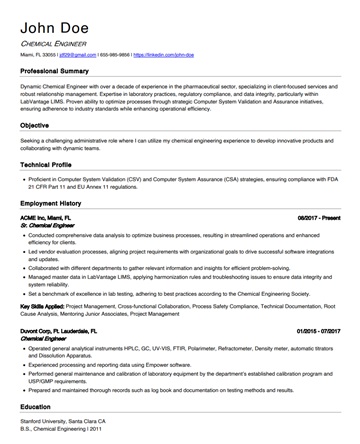
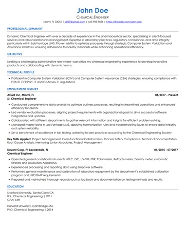
Traditional and Chronological
Steady career path, no major gaps. The safest structure for large-employer portals.
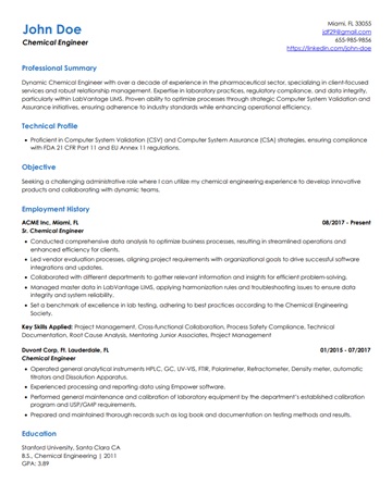
Senior and Executive
Leadership, consulting, and long histories. Comfortable at two pages in Docs.
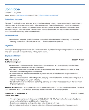
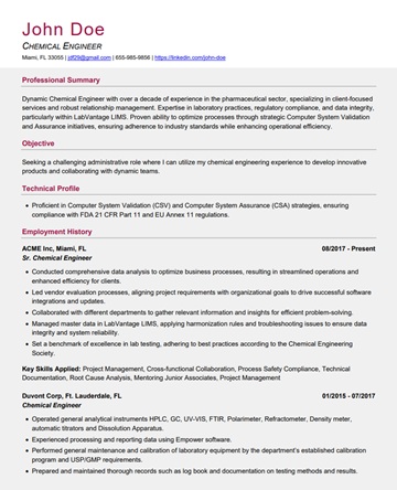
Modern and Creative
Subtle color for tech, design, marketing, and startup roles. Still single-column.
Career Changers and Hybrid
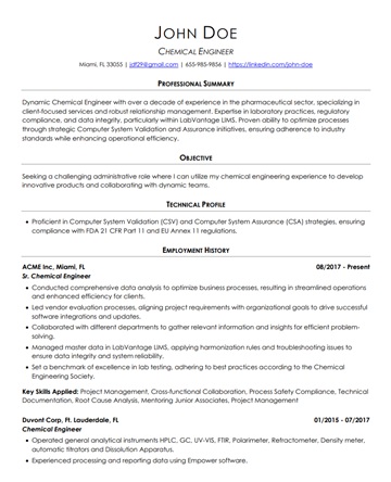
Skills summary up front, full history underneath. Built for non-linear paths.
The Five Built-In Google Docs Resume Templates
Google ships exactly five: Swiss, Serif, Coral, Spearmint, and Modern Writer. Open docs.google.com, click Template gallery at the top right, and scroll to the Resumes row. The set has not visibly changed in years and Google has never announced a replacement for it.
Swiss
Swiss is the plainest of the five and the usual default recommendation: Raleway headings, orange accents, standard section labels, and a skills block placed high on the page. That last detail matters more than the styling, because Jobscan's survey of 384 recruiters found 76.4% filter a candidate list by skills keywords before anything else. The orange accents are text formatting rather than images, so restyle them on taste alone.
The one open question: descriptions of Swiss split between "clean single column" and "two columns with a wide left margin." The likeliest explanation is a deep left indent that reads visually like a second column without being one, but that distinction changes the parsing verdict entirely, so confirm it rather than assume it.
Check it yourself: open the template, click into the experience block, then open Format → Columns. If the single-column option is already highlighted, Swiss is a one-column document and safe as shipped.
Spearmint
Spearmint is a single-column layout with bright green section titles and a thick green rule between sections. It is the most legible of the five at a glance, which is worth something: the widely cited Ladders eye-tracking study put the initial recruiter scan at 7.4 seconds, though that study dates to 2018, ran with 30 recruiters, and did not disclose how they were selected, so treat it as directional rather than as a measurement. The heavy heading emphasis is safe, because bold, size, and color are text formatting and a parser reads straight through them.
Check it yourself: click on a green section rule. If a table toolbar appears, the rule is a table border and the section around it is a table, which is the one structure worth changing before you apply. If nothing appears, it is a paragraph border and there is nothing to fix.
Coral
Coral is a single-column layout with Playfair headings and warm coral accents, the friendliest looking of the five and a reasonable pick for startups, nonprofits, and design-adjacent roles. Its open spacing means less content fits per page, which is the real trade-off, not a parsing one.
A correction we owe readers: an earlier version of this article said Coral's default font is Merriweather and that serif faces are discouraged for ATS. Both halves were wrong. Merriweather belongs to the Serif template. And a serif body face has no effect on parsing at all, because a parser extracts characters, not typefaces.
Check it yourself: select the whole document and look at the font dropdown. More than one value means you have mixed fonts while editing, which is a legibility problem worth fixing before you export.
Modern Writer
Modern Writer is a single-column layout set in Roboto Condensed with pink accents and an unusually prominent name treatment. It is the closest of the five to what a professional resume writer typically produces, and it suits writing, media, editorial, and communications roles.
The name and contact block is styled differently enough from the body to be worth one specific check. If that block sits in a document header rather than the body, a parser that skips headers captures a resume with no name, no email, and no phone number, and no amount of keyword matching survives that. We are not asserting that it does, because no published source has inspected the underlying file, and inventing that answer is exactly the kind of confident detail that turns out to be wrong.
Check it yourself: click directly on your own name at the top of the page. If the cursor lands in a grey header region separated from the body, move that block into the body before you apply.
Serif
Serif has a genuine two-column body, set in Merriweather with blue section titles. These are real document columns rather than a visual effect, and the clearest evidence is not a review site: it is a thread in Google's own Docs help community from a user who could not remove the column formatting from the second page of this specific template. Someone fighting the underlying structure is better proof than any description of it.
Contact details are not the problem: the name and contact block sits in a full-width band across the top, above the split. The risk is the two-column region underneath, which holds work experience and the optional sections, precisely the content that has to survive in reading order.
Two things we previously said about Serif and no longer stand behind: that it is the only built-in with two columns, which cannot be asserted while descriptions of Swiss are still in dispute, and that its contact information sits in a left sidebar, which is wrong on the location and, depending on the source, on the side too.
Keep Serif without the risk: select the two-column region, open Format → Columns, and choose the single-column option. You keep Merriweather, the blue section titles, and the six optional sections, and the document becomes a straightforward one-column resume. This is a better move than avoiding the template if you like how it looks.
Which Google Docs Resume Template Is Best?
Swiss is the best Google Docs resume template for most people, because it combines standard section headings, a skills block placed high on the page, and decoration that is text formatting rather than images. Spearmint is the better pick if you want stronger visual structure and the green suits your industry. Serif is the best looking of the five and the only one that needs a fix before you send it. If none of the five fits, one of the eight templates above will, and they arrive already structured for parsing.
The honest framing is that template choice is a small lever compared with what you write in it. All five built-ins are recoverable, four of them need nothing done to them, and none of them will rescue a resume that does not carry the language of the job you are applying to. Pick on fit and industry, then spend your remaining time on the content. If you want the gaps between your resume and a specific posting listed out before you apply, check your resume against the job description and work down the list.
| Your situation | Pick | Why |
|---|---|---|
| Skills-heavy technical resume | Swiss | Skills sit high on the page, which is where recruiters filter first |
| You want clear visual structure | Spearmint | Strong heading contrast with no images and no layout tables |
| Startup, nonprofit, or design-adjacent | Coral | Warmest of the five, single column, open spacing |
| Writing, media, or communications | Modern Writer | Editorial feel; verify the contact block is in the body |
| Banking, law, government, accounting | Classic (download above) | Conservative reverse-chronological structure with no color at all |
| Senior leadership, two pages | Signature (download above) | Built to stay readable past page one; the built-ins are one-page designs |
| Career change or a non-linear history | Professional (download above) | Skills summary up front, full history underneath |
| You want Serif's typography | Serif, converted to one column | Keeps the look, removes the reading-order risk |
Parsing Safety: The Five Things That Actually Break a Google Docs Resume
No outside party can obtain a field-extraction report from Workday, Taleo, or iCIMS. Those systems parse a resume inside an employer's own tenant during an application, and no public endpoint accepts a file and hands back what it read. Any article showing you a per-template pass or fail grid across named enterprise ATS platforms did not run that test, and an earlier version of this page carried exactly such a grid. It is gone, and no number replaced it, because there is no honest number to put there.
What can be assessed, and what actually determines the outcome, is structure. A parser reduces a page to one top-to-bottom stream of text and then segments that stream into fields. Five structural features decide whether your content survives the flattening, and you can inspect all five yourself.
1. Column count
Side-by-side columns are the single biggest risk, because the reading order is ambiguous. A parser working left to right across the page can interleave the two columns line by line, producing a stream where a job title from the right column lands between two skills from the left. Segmentation then fails on content that was perfectly written.
Inspect: click into the body and open Format → Columns. Fix: set the region to one column.
2. Tables used for layout
A table flattens cell by cell along each row, so a two-cell layout row produces the same interleaving problem as a column, with the added risk that some parsers drop table content wholesale. EDLIGO, an HR software vendor, analysed a set of rejected resumes and reported .docx files relying on tables at a 31% rejection rate against 4% for plain .docx. That analysis names neither its parsers nor its dataset, so read it as directional. The mechanism holds regardless of the number.
Inspect: click on any block that looks aligned in a grid. A table toolbar appearing means it is a table. Fix: use tab stops for side-by-side text such as dates.
3. Text boxes and floating elements
Content inside a text box or a drawing sits outside the main body flow. It is not later in the stream, it is frequently not in the stream at all. A skills sidebar built as a text box is invisible to the parser while looking perfect on screen, which makes this the hardest failure to catch by eye.
Inspect: click the block; a text box selects as an object with drag handles rather than placing a cursor. Fix: retype the content as normal body paragraphs.
4. Header and footer content
Page headers and footers are a separate region of the document, and resume parsers commonly skip them. The usual casualty is the contact block, the worst possible thing to lose: a resume that parses perfectly but arrives with no email address cannot be actioned. This is one of the clearest advantages Google Docs has over the Word template libraries, where header-based contact blocks are common.
Inspect: click your name at the top of the page and see whether the cursor enters a separate header region. Fix: move name, phone, email, city and state, and your LinkedIn URL into the first lines of the body.
5. Graphics and non-standard section headings
An image contributes zero characters, so a skills bar chart is a blank space to a parser and a headshot is worse than nothing. Non-standard headings fail differently: the parser matches against expected labels, so "Where I Made An Impact" maps to no field and the content beneath it can be filed nowhere.
Inspect: ask whether a stranger could tell which section is which from the label alone. Fix: rename to Experience, Education, Skills, Certifications, and Summary.
One myth to retire while you are in there: font family does not affect parsing. Choose Arial, Calibri, Georgia, Garamond, or Cambria for legibility, not because a guide told you serifs get filtered.
Customizing a Google Docs Template Without Breaking Parsing
Most parsing damage is self-inflicted, done during editing to a template that shipped fine. Work through these five steps in order and the structure survives.
Step 1: Open your own copy first
- For a built-in, open docs.google.com, click Template gallery at the top right, and choose from the Resumes row. Docs creates your copy automatically.
- For a downloaded .docx, use File → Open → Upload, then rename it to
FirstName_LastName_Resume. Some portals show recruiters the filename you uploaded. - Before you type anything, run the five structural checks above. Fixing a two-column layout takes seconds on an empty template and is tedious once it is full of your content.
Step 2: Replace the placeholder content section by section
Work top to bottom so you do not leave orphaned placeholder text behind:
- Contact details. Name, city and state without a street address, phone, email, LinkedIn URL, and a GitHub or portfolio link for technical and design roles. All of it in the body.
- Professional summary. Two or three sentences carrying your title, years of experience, one quantified result, and the two most important phrases from the posting.
- Work experience. Reverse chronological, one action verb and at least one number per bullet. "Increased conversion rate 23% across four product pages through A/B testing" beats "Responsible for improving website performance."
- Education. Degree, institution, year. Include a GPA only if it is 3.5 or above and you graduated within the last three years.
- Skills. Use the posting's exact wording. If it says Python, write Python, not "Python3" or "python programming."
Step 3: Keep the formatting boring on purpose
- Fonts. Arial, Calibri, Garamond, Georgia, or Cambria at 10 to 12pt body and 14 to 16pt headings. One family throughout.
- Margins. 0.5 to 1 inch. Tighter than half an inch and the page stops being readable in print and in portal previews.
- Section headings. Standard labels only. Jobscan's recruiter survey found 76.4% filter by skills first, so name the block "Skills" or "Technical Skills" and let it be found.
- Bullets. Use the list tool in Google Docs. Do not paste in checkmarks, arrows, or emoji, which can arrive as stray characters or as nothing.
- Headers and footers. Leave them empty. Anything you put there may never reach the parser.
Step 4: Rewrite for the specific posting, in the posting's words
Matching is largely literal. EDLIGO's vendor analysis reported that only about a third of the systems it looked at handled synonyms or semantic equivalents at all, which means "managed projects" and "project management" can easily be two different things to the software. For each application:
- Pull the 10 to 15 load-bearing terms out of the posting: titles, tools, certifications, named methodologies.
- Make sure each one appears at least once, inside a real accomplishment rather than stuffed into a list.
- Use the posting's phrasing verbatim for the terms that are clearly requirements.
- Spell out an acronym once alongside its expansion, as in "Project Management Professional (PMP)", so both forms are indexed.
Step 5: Export in the format the portal wants
- ATS portals: File → Download → Microsoft Word (.docx). EDLIGO's analysis put plain .docx at the bottom of its rejection range, and .docx is what most portals are tuned for.
- Email to a person: PDF, so the layout is fixed on their screen.
- When the posting names a format: use that one. An explicit instruction outranks any general rule, including this one.
One qualifier worth carrying, because it is routinely dropped: EDLIGO's higher rejection figure applies to PDFs with embedded fonts, not to PDFs in general. A text-based PDF from Google Docs is not the same object as a design-tool PDF that has flattened your words into artwork. The rule is not "PDFs are bad," it is "PDFs whose text cannot be selected are bad."
How Resume Optimizer Pro Reads a Google Docs Export
Resume Optimizer Pro's parsing check reads a resume the way an applicant tracking system does, as a single top-to-bottom stream of text, which is why we judge a Google Docs template on whether its content survives being flattened into that stream rather than on how it looks on screen: anything sitting in a second column, a table cell, a text box, or a page header has to earn its place in the reading order before it can earn a keyword match.
The match score that follows is built on the same principle. It is not a count of how many keywords appear. Our engine weights a required skill by where it sits in your history: a skill demonstrated in your current role carries full weight, the same skill in a role from five years ago is discounted for recency, and a skill that appears only in a skills list or a summary line, with no role behind it, carries a fraction of the weight. Appearing in both a role and the skills list scores higher than either alone. Hard skills outweigh soft skills. Job-title alignment and management scope are scored separately from skill coverage.
The score is deliberately capped below 100. No tool outside the employer's own ATS can certify an outcome, and any product that shows you a perfect score is telling you something it cannot know. What it can tell you is which required skills are missing, which ones are buried where they carry least weight, and which structural features of your document are putting content at risk before the matching even starts.
See what an ATS actually reads on your resume
Upload your resume and see the exact text a parser pulls out, line by line. We fix the formatting automatically.
Google Docs vs Word vs Canva
The most-cited comparison of the three comes from Enhancv, which ran resumes from each platform against Indeed's parser. Two caveats before the numbers: it was first published in 2023 and carries a 2026 refresh date, so it is not new research, and Enhancv is a resume-builder vendor whose own product placed near the top of its own test. Read it as a vendor benchmark that happens to point the same way as the structural argument, not as independent research.
| Factor | Google Docs | Microsoft Word | Canva |
|---|---|---|---|
| Parsing accuracy (Enhancv vendor test) | 95.77% | 84.85% (listed as MS Office) | 80.07%, and 73% for designs with infographics |
| Cost | Free with any Google account | $99.99/year, Microsoft 365 Personal list price, checked Aug 2026 | Free tier; Pro $18/month list price, checked Aug 2026 |
| Built-in resume templates | 5 | Dozens | Thousands |
| Default structural risk | Low. Four of five are single column; Serif needs one fix | Mixed. Header-based contact blocks and layout tables are common | High. Most designs use columns, graphics, and floating elements |
| Export formats | DOCX, PDF, ODT, RTF, TXT | DOCX, PDF, RTF, TXT | PDF, PNG, JPG |
| Built-in AI writing help | Gemini in Docs, paid editions only | Paid add-on | Paid tiers |
Google Docs wins for most job seekers, and the reason is structural rather than statistical: its five templates are almost all single column, they keep contact details in the body, and they contain no images. Word is a fine alternative if you already pay for it, but its larger template library is a liability rather than an advantage, because a meaningful share of those designs put your name in a page header or your dates in a table. Canva is the one to avoid for anything going through a portal. Its strength is visual design, and visual design is exactly what a parser throws away. Canva is fine when you are emailing a PDF to a named human who will read it themselves.
Does Google have a resume builder?
No, not as a distinct product. Google Docs ships templates and nothing more. Google Hire, the applicant tracking system Google sold to small and mid-sized businesses, was discontinued on September 1, 2020, and Google for Jobs is a search surface rather than a document tool. The nuance is that Google itself markets Gemini under that exact phrase: Google's own Gemini site states that with Canvas, Gemini acts as your AI resume builder. Canvas is a general-purpose document and code surface launched in March 2025, not a career product, so what you are really getting is a chat assistant with a document pane.
Gemini inside Docs is older than most articles suggest, and it is not free. "Help me write" arrived in Google Docs in August 2023. The Workspace Updates post many guides describe as the launch is dated April 22, 2026 and is explicitly an upgrade, announcing four capabilities rather than three: an upgraded "Help me create," "Help me write," "Match writing style," and "Match doc format." Promotional higher usage limits covering the two Match features ran through July 15, 2026 and have since expired.
Where the Templates Are, and What Happened to Them
Google's own support documentation confirms the path: in Docs, click Template gallery at the top right, and Google-created templates including resumes are there. If you cannot see it, one of three things is true, and none of them is that Google deleted the resume templates.
- The gallery is collapsed. On the Docs home screen the template row can be hidden. Look for the toggle that shows or hides templates and switch it back on.
- A Workspace administrator switched it off. On a work or school account, template visibility is an admin-controlled setting. Your personal Google account will still show the gallery.
- You are signed out. The template gallery requires a signed-in Google account and redirects to a sign-in page otherwise, which is also why it never appears in search results.
As for whether anything was removed: Google has not announced any change to its resume templates. The most recent Docs template announcement, dated December 10, 2024, added 40 new designs for blog posts, proposals, roadmaps, onboarding guides, and class notes. Resumes were not part of that release and nothing was described as retired. One point of confusion worth clearing up: Plum is not a discontinued resume template. It belongs to the Letters gallery, alongside Geometric, and it sits next to cover-letter versions of Modern Writer, Spearmint, and Serif. If you remember a Plum resume, you are most likely remembering a Plum cover letter.
Common Google Docs Resume Formatting Mistakes
EDLIGO's analysis of rejected resumes attributed them to qualification mismatch (57%), parsing errors (23%), formatting issues (12%), and knockout filter failures (8%). Treat the split as directional, since the vendor did not publish its dataset. What is useful is the ordering: the largest cause is not a formatting problem at all, and the two that are, roughly a third between them, are the cheapest to prevent.
Building layout with tables
If you need a date sitting to the right of a job title, use a right-aligned tab stop rather than a table row. It looks identical on the page and it stays a single line of text in the stream.
Putting content in text boxes or images
Google Docs will happily let you insert a text box or a drawing, and a parser will happily ignore it. If it is not typed as ordinary body text, assume it does not exist.
Inventing section headings
"Core Competencies Matrix" and "My Professional Journey" map to no field, so the content beneath them can be filed nowhere. Use the standard labels and be creative in the bullets instead.
Moving contact details into the page header
It looks tidy and it is the most expensive mistake on this list. Keep name, phone, email, and location as the first lines of the document body, where they will actually be read.
Exporting a PDF whose text is not selectable
A text-based PDF exported from Google Docs is usually fine. A design-tool PDF that has flattened your words into artwork is unreadable to every parser, which is where most of the "never send a PDF" advice actually comes from. Open the file and try to select a line before you submit it.
Leaving placeholder text behind
Submitting a resume that still says "Your Company Name" or carries the template's own instructions happens more often than you would expect, particularly in the optional sections nobody scrolls to. Before exporting, search the document for "your," "insert," "example," and "lorem."
If there is no existing resume to fix, you can build a resume from scratch by answering five short steps and watching the draft form as you go.
Frequently Asked Questions
Related Articles
Best ATS Resume Templates 2026: 8 Free Downloads
Get 8 free ATS-friendly resume templates as single-column Word files, plus the formatting checklist each one follows. Do...
Read More
Best Resume Fonts 2026: 12 Tested on 5 ATS Engines
We tested 12 resume fonts on 5 ATS engines across 2,800 resumes. See which parse cleanly, which get silently substituted...
Read More
PDF vs DOCX Resume: Why PDF Fails ATS Parsing (2026 Data)
ATS parsing success rates drop 25% with PDF resumes. See 2026 test data across Workday, Greenhouse, Taleo, iCIMS, and Le...
Read More