An applicant tracking system was detected for 97.8% of Fortune 500 companies in 2025, roughly 489 of the 500 (Jobscan ATS Usage Report, 2025). Before a recruiter ever sees your resume, software parses it, and the human who eventually opens it spends about 7.4 seconds on the first pass (Ladders eye-tracking research, 2026). Those two facts, machine parsing first and a seven-second human glance second, explain almost every shift in resume style over the past two decades. The decorative resume that once helped a candidate stand out now actively works against them. This is a data-driven look at what changed, what is genuinely obsolete in 2026, and what formats earn callbacks today.
Why Resume Styles Changed at All
For most of the twentieth century the resume was a print document read entirely by people. Candidates in design-adjacent fields used multiple typefaces, borders, photos, and personal logos to signal taste and stand out in a paper stack. That made sense when a human was the only reader and the applicant pool for a given role was small.
Two changes broke that model. First, the volume of applicants per opening exploded as job boards lowered the cost of applying to near zero, so employers needed software to triage. Second, that software, the applicant tracking system, does not look at a resume. It extracts structured data from it: your job titles, dates, skills, education, and credentials. Anything that interferes with extraction, columns, text boxes, images, tables, now risks the resume being parsed into garbage before a person can even rescue it. 88% of employers believe they lose qualified candidates because resumes are screened out by ATS for being hard to parse (CoverSentry ATS Statistics, 2026).
So style stopped being about taste and became about machine legibility plus a seven-second human scan. Every trend below follows from that single shift.
Reader 1, the parser: extracts titles, dates, skills, and education as structured fields. Rewards clean, linear, single-column text. Punishes columns, graphics, and tables.
Reader 2, the recruiter: spends about 7.4 seconds on the first look. Rewards scannable structure, quantified results, and an obvious match to the role. Punishes dense paragraphs and buried achievements.
Then vs Now: The Resume in One Table
The fastest way to see the evolution is element by element. The left column is what looked sophisticated in the print era. The right column is what survives machine parsing and a seven-second scan in 2026.
| Element | Then (print era) | Now (2026) | Why it changed |
|---|---|---|---|
| Top section | Objective statement ("Seeking a role where I can grow") | Professional summary focused on what you deliver | Objectives describe what you want; summaries spend the same space on keywords and value |
| Photo | Headshot to add a personal touch | No photo (outside specific markets and creative niches) | Images are not parsable, invite bias, and waste prime space |
| Layout | Two-column or graphic-heavy design | Single-column, linear top-to-bottom flow | Some ATS read columns left to right and scramble the text |
| Bullets | Duty lists ("Responsible for managing a team") | Quantified achievements ("Cut onboarding time 30%") | Numbers survive the seven-second scan; duties do not |
| Closing line | "References available upon request" | Removed entirely | It states the obvious and burns a line that could hold keywords |
| Skills | Buried in dense prose paragraphs | Skills surfaced and evidenced inside dated work history | Skills-based hiring is now used by 64.8% of employers |
What Is Genuinely Obsolete in 2026
Some advice gets repeated long after it stopped being true. These four elements are not merely old-fashioned; they measurably hurt a modern resume, either by breaking the parser or by wasting the seven seconds a recruiter gives you.
The objective statement
An objective tells the employer what you want. In a market where you have roughly seven seconds, that real estate is better spent on a professional summary that signals what you deliver and front-loads the role's core keywords. The summary replaced the objective for a reason: same space, far more useful.
The photo
In the United States, United Kingdom, Canada, and Australia, a photo is a liability. It is not machine-readable, it can introduce bias that prompts some employers to discard the resume outright, and it consumes the most valuable space on the page. Creative portfolios belong on a linked site, not embedded in the document the ATS reads.
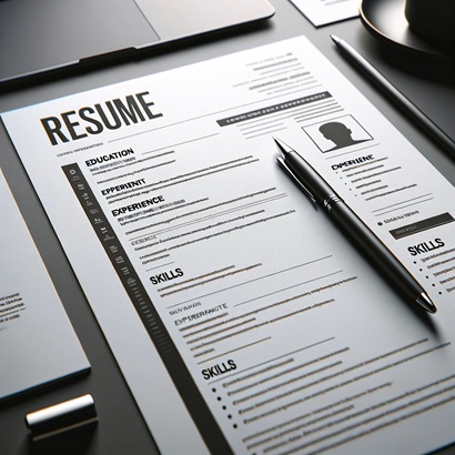
Multi-column and graphic-heavy designs
Two-column templates look polished to a human but can be scrambled by parsers that read straight across the page, turning a tidy layout into jumbled, out-of-order text. Skill bars, icons, and infographic charts carry zero parsable information. The safest layout across every system is a single column.
"References available upon request"
Every hiring manager already knows they can ask for references. The line adds no keyword value, states the obvious, and burns a line that could carry a skill or result. Some ATS even flag the stray section. Keep references on a separate sheet, ready when asked.
What Actually Wins Today
The modern resume is not just "simpler." It is engineered for two readers at once. Four characteristics define the formats that earn callbacks in 2026.
One linear column, standard section headings (Summary, Experience, Skills, Education), a common sans-serif typeface, and no text boxes or tables. This guarantees the parser extracts every field in the right order. For the full breakdown of which formats parse cleanly, see our guide to resume formats.
With 64.8% of employers using skills-based hiring (BetterCV Resume Trends, 2025), the resume that surfaces concrete, relevant skills, and proves them inside dated work history, beats the one that hides them in prose. Listing a skill is a claim; showing it inside a role with dates is evidence.
Resumes that quantify results in at least half their bullets score roughly 15 points higher than purely descriptive ones, and 34% of recruiters call the absence of result statements a dealbreaker (high5test, 2024 to 2025). Numbers are what survive a seven-second scan.
The hybrid (combination) format opens with a skills-rich summary, then backs it with a reverse-chronological work history. It satisfies the parser, the seven-second scan, and skills-based screening at once. Our hybrid resume guide walks through the full structure.
The 2026 Resume By the Numbers
Four figures capture why the style shift is not a matter of taste. They are the constraints every modern resume is built around.
Roughly 489 of 500 use applicant tracking software (Jobscan, 2025)
Average time a recruiter spends on the first pass (Ladders, 2026)
Share of employers screening for skills, not just credentials (BetterCV, 2025)
Lift in shortlist odds for resumes with quantified achievements (high5test, 2024)
Before and After: The Same Candidate, Two Eras
Style is easier to see than to describe. Here is one work history entry written in the old elaborate convention and in the modern convention. The underlying experience is identical; only the presentation changed.
Format: two-column layout, headshot top-left, objective statement, skill bars showing "Marketing 90%"
Bullet: "Responsible for handling the company's social media and various marketing duties as assigned."
Parser sees: scrambled column order, an unreadable image, a vague duty with no skill or result. Recruiter sees: nothing concrete in seven seconds.
Format: single column, professional summary, no photo, plain section headings
Bullet: "Grew organic social following 142% in 12 months and drove $310K in attributed pipeline through SEO and paid campaigns."
Parser sees: clean linear text, extractable skills (SEO, paid campaigns) with dates. Recruiter sees: a number that lands instantly.
Same person, same job, same achievements. The modern version simply removed everything the parser cannot read and replaced vague duties with quantified results the recruiter can absorb in a glance.
The AI Era: Style Matters More, Not Less
A common assumption is that AI screening makes formatting irrelevant, that smart software can figure out a messy resume. The opposite is true. 48% of hiring managers already use AI to screen resumes, a share projected to keep climbing sharply (The Interview Guys, 2025). AI screening is faster and more systematic than a human scan, which means it is less forgiving of omissions and parsing failures, not more.
The matching engine does not reward a beautiful template. It rewards a resume it can read cleanly and a set of skills it can extract, time-stamp, and match against the job. That is exactly why the style trend points toward clean structure and concrete, quantified content. The format that an AI screener handles best is the same single-column, skills-forward, quantified resume that a human scans best. Style and substance converged.
This is also why decorative resumes fail twice over in 2026. They confuse the parser, then they fail the seven-second human read because the achievements are buried in design. The candidates who win are the ones whose resumes are legible to both readers at once.
For the first time, what the machine reads best and what the human reads best are the same document: a single-column, skills-forward, quantified resume. The era when "looks good to people" and "parses well for software" were in tension is over. Optimize for one and you optimize for both.
How Resume Optimizer Pro Handles the Style Shift for You
Knowing the rules is one thing; applying them to your own resume is another. Resume Optimizer Pro rebuilds your resume into the format this article describes automatically. It converts multi-column or graphic-heavy layouts into a clean single-column structure the parser reads correctly, strips the obsolete elements (objectives, photos, the references line), and surfaces your real skills inside your dated work history so a skills-based screener can extract recency and duration.
ATS optimization is automatic and done for you. You do not manually hunt for keywords or reformat columns by hand. You upload your resume, paste the job description, and receive a match score showing exactly how well your background aligns with the role, plus a version rebuilt in the modern, parser-clean style. The templates are designed to be consumable by any ATS while still reading cleanly for the recruiter who opens them, including on mobile.
Frequently Asked Questions
Optimize your resume for any ATS instantly
Upload your resume and add a job for a free ATS-optimized version. Only your email is required.
Related Articles
3 Resume Formats Compared: Which One Gets You Hired? (2026)
Chronological, functional, or hybrid? See ATS pass rates for each format, visual layout comparisons, and a quick decisio...
Read More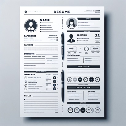
Hybrid Resume Template & Examples: Complete Guide for 2026
Hybrid resumes parse within 2 to 3 points of chronological in Workday, Greenhouse, and iCIMS. Learn when to use one, who...
Read More
Why Fancy Resume Templates Hurt Your Job Search (And What to Use Instead)
Fancy resume templates with graphics, columns, and tables wreak havoc on ATS parsing software. Learn why simple, text-ba...
Read More